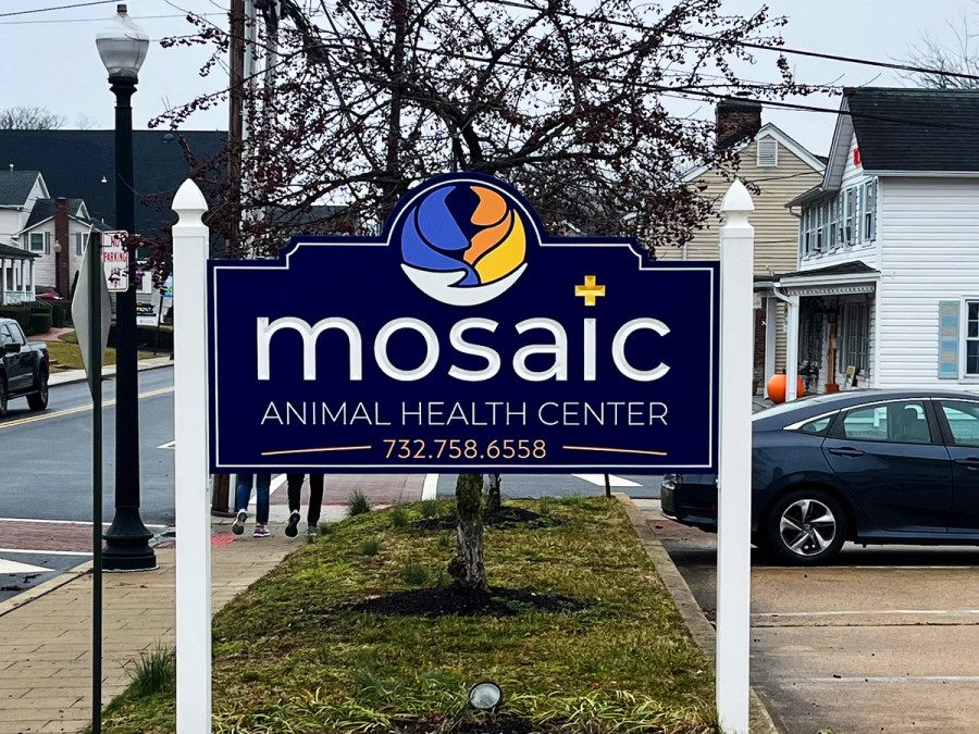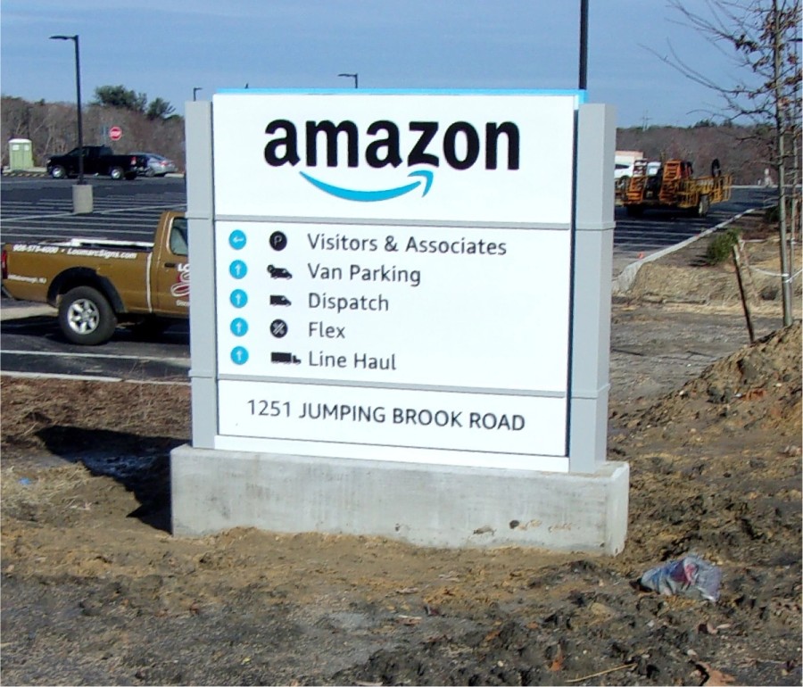


Your customer gets into his car and starts the engine. Driving out of the driveway, he’s heading out to run errands. He will be driving by your business on the way to his first stop. This is your moment to be noticed. How will you get his attention?
Display an outdoor sign designed to make your business highly visible.
And how do you do that? First, you need to understand what a potential customer views when driving near your business location.
In the car, the driver is distracted by the music playing, his own thoughts, children and other passengers while doing the primary task of driving (hopefully) safely. Outside the car, capturing his attention is hard, because you’re competing with bad weather, nighttime vision, and other businesses. You understand what you’re up against.
Attracting a driver’s attention to your sign depends on these factors: the sign’s size, color, design, and placement. But the most important factor is “the amount of contrast between the sign and its surrounding environment,” according to the United States Sign Council Foundation.
When the person drives in complex conditions and landscape, then his ability to detect your sign decreases. So if your potential customer is fully engaged in driving, which happens as he travels through downtown or a multi-lane highway, a longer time elapses before he notices your business sign.
One way to overcome this challenge is to illuminate the sign, said Larry Gliozzi, owner of Loumarc Signs. Research by the USSC Foundation has found “an increase in detection after dark for internally illuminated signs over similar signs viewed under daylight conditions.” For more info, view our illuminated signs and check out the simple guide to illuminated channel letter signs.

Let’s talk about how the business sign’s size, message, orientation and location affect visibility for drivers:
The sign needs to be an optimum size — large enough to be noticed, but not too large that the message is difficult to read in a single glance. Whether the person is moving or standing still also affects the sign size. Depending on the location, different sizes may be best for the pedestrian versus the highway driver. Regulations by town or city usually indicate the maximize size. Loumarc Signs team first determines the size allowed before recommending designs.
A driver has only a few moments to scan your sign. You have time to communicate only one idea, not dozens. Do you want to show directions? Display the company’s name? Feature a specific product? You must choose one. Otherwise, the person cannot grasp the message.
A business will get maximum results if the name also reflects what they do, for example, Loumarc Signs.
“Short messages and simple fonts take less time to read and comprehend than long messages and cursive or decorative fonts,” —according to the USSC Foundation.
And Larry agreed. “Keep the sign simple and don’t overcrowd the sign,” he said. Avoid adding too many graphics or too ornate a typeface. Use discretion when using a drop shadow, or a graphics effect that makes the element look three-dimensional. The drop shadow may negatively affect visibility.
“Current research on average reading times indicates that signs displaying four to eight words in simple topography can be comfortably read and comprehended in approximately four seconds, which results in a reading time, or message scan, of one-half second per word.” — United States Sign Council Foundation On-premise Signage study
You’ve probably heard the basic rule of visibility: 1 inch of letter height is readable about 30 feet. A caveat: This assumes an ideal viewing situation. Remember, in the real world, a driver experiences inclement weather, traffic and road construction … so it’s more of a guide than a statute. Larry also considers the speed of traffic when analyzing readability.
Your potential customers will see the sign most clearly when they are directly in front and facing it. Moving the sign up, down, or to the side, and every angle of rotation — even slightly — affects the visibility.
Orientation is defined as the relative angle of view between the sign and the viewer. What is optimum? Signs positioned perpendicular to the person. So people are less likely to notice a sign in a parallel or side-oriented view. When the viewer initially sees the sign, the viewer’s sight range is within a cone of vision extending 10 degrees to either side of the person.

When a sign consultant meets you at your business, they will be assessing where you plan to place the sign. Just like real estate, location matters. People cannot see the message if they lose line of sight to a sign. Trees, snow banks, and landscaping can obstruct the view. Buildings, utility poles, traffic signals and other signs can also block the sign. What else can interfere? Pedestrians, parked cars, and traffic can.
Because sign location is tricky, experienced sign consultants are trained to determine the optimal height and setback for a sign to maximize its visibility.
Of course, you can also rely on your sign company to show you how to make your sign stand out from the crowd. If you would like to know more ways to increase the visibility of your business, click the button below.

At Loumarc Signs, our partnership begins with a strategic conversation, aimed at understanding your vision and aligning our paths towards your grand success. Our expert team is here to generate clear expectations, answer your clarifying questions, and foster a beneficial relationship built on mutual understanding. We are not just sign makers, we are partners on your journey of recognition and achievement, always ready to provide the guidance you need.
Once we grasp your objectives, our team at Loumarc Signs will tactically survey your sign location, capturing every detail to create a design that embodies your brand. Utilizing our experience, we ensure your vision is accurately manifested with an image that stands out. Our goal isn't merely execution; it's the successful amplification of your brand's visibility in the marketplace.


With all approvals in hand, our expert team at Loumarc Signs stands poised to transform those designs into compelling, brand-enhancing awareness. We're here to remove weight on your shoulders. Throughout this transformative journey, we'll maintain clear, calculated touch points, keeping you informed on milestones such as zoning approvals. Our strategic partnership grants you more time to focus on your core business, while we handle the art of making your brand's image resonate in the marketplace.
Having been a business owner I know what it means to desire great brand visibility. I'll be your stratgic partner to greater brand awareness.
Everyone's journey and goals are different. We understand that we're a step towards those goals. Reach out and tell us your vision.


At Loumarc Signs, we are seasoned craftsmen, artfully elevating your brand's visibility. Since 1994, we have proudly served New Jersey, New York, and beyond, nurturing brands with strategic precision. Our commitment is not just to create signage, but to provide a tactical advantage that amplifies your brand's awareness, recognizing its worthy image.
Let us join you in the journey of transformation and evolution, where your brand's success is also our success. With our partnership, your brand's appearance will inspire and awaken understanding.